THREE.JS MOCKUPS
Building interactive mockups with Astra
An experiment in putting editable, moving designs into photographs—and making the lighting respond to them.
Try the mockups ↓Hey, I’ve been working with Astra on a small experiment: taking the sort of mockup you’d use to present a design and making its content editable and animated in the browser.
It started with a reference photograph of someone holding a newspaper. I wanted to put an app design onto the paper, keep the folds and texture, and have the content move. As that started working, I kept adding references: a phone in someone’s hand, a laptop on a concrete block, and rooms with huge illuminated displays.
What we were trying to achieve
The aim was to keep the photographic quality of those references while giving us control over the design inside them. You should be able to change a headline, upload artwork, or animate a layout, and see it sit properly on the screen or paper.
The photograph itself needed to stay still. On the newspaper, the content should follow the fold and remain behind the fingers. In a room, changing the screen from green to blue should also change the light reflected across the floor. Those details became the main work of the experiment.
Why this is useful
A design can look quite different once it’s shown at an angle, held in a hand, or placed on a large display. Adding motion gives you another thing to judge: how a scrolling interface or animated graphic reads in that setting.
Making the mockup editable means we can try different designs in the same scene without preparing a separate composite for every version. It also gives someone reviewing the work a way to explore it themselves. The examples below let you change the content and adjust its lighting rather than relying only on an exported image.
How Astra helped
I supplied the references and feedback on what looked wrong. Astra wrote the React interface and Three.js rendering code, used Codex image generation to prepare backgrounds and material maps, and connected those assets to the shaders.
That involved a lot of adjustment. I’d point out a reflection that was too sharp, a mask cutting into a chair, or paper that looked too clean. Astra would revise the relevant image or rendering code, inspect the result in the browser, and run code checks. We also dropped a meeting-room scene when the result wasn’t good enough.
The useful part was being able to work across those tasks in the same session. Generating an image was only one step: it then needed to line up with the scene, respond to the editable artwork, and survive a closer look. The technical walkthrough after the examples explains how we handled that.
INTERACTIVE EXAMPLES
The mockups
Choose a scene. Edit the headline or upload your design, then adjust the material and lighting. Your headline and image carry across scenes.
 Exhibition hall02
 Architectural wall03
 Auditorium04
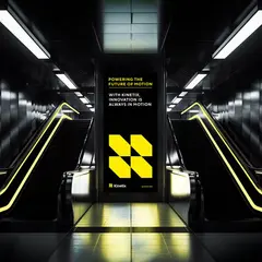 Escalator05
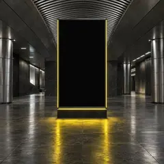 Concourse06
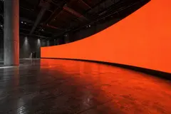 Curved wall07
Edit artwork and lighting +
These are working browser renders. Only the artwork and its surface response animate. Export a still from the controls.
Choosing a fixed-camera approach
The fixed camera made a photographic composite practical. Astra could preserve the detail in the reference image and add geometry or coordinate mappings for the surfaces receiving artwork. A chair could remain part of the photograph, provided a mask prevented the floor reflection from being drawn over it.
As I supplied more references, Astra added a phone in hand, a reflective room, an industrial laptop, a neon gallery, an exhibition hall, an architectural display, and an auditorium. It brought them together behind one scene selector and shared state for the headline and uploaded image. Each renderer handles the surface treatment appropriate to its photograph.
Generating the photographic backgrounds
Astra used Codex image generation to create background images with the original artwork removed. The prompts asked it to preserve the viewpoint, objects, and material detail from the reference. These images became the photographic plates underneath the browser rendering.
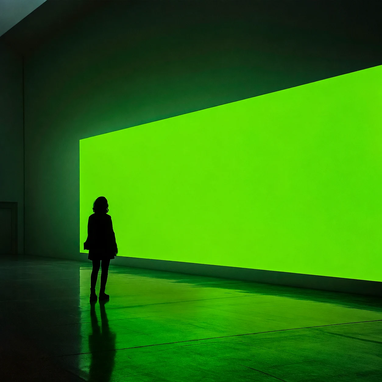
The exhibition hall exposed a problem with this approach. Its reference contained a green display and green illumination across the floor. Replacing the display left that illumination behind. I asked whether the entire floor response could come from the current design, so changing its colour would also change the room’s lighting.
Astra generated a neutral version of the hall and moved the coloured reflection and spill into the shader. The base image supplies floor texture and tonal variation. The shader samples the current artwork to supply colour, with masking and photographic shading preserving foreground objects and dark contact areas.
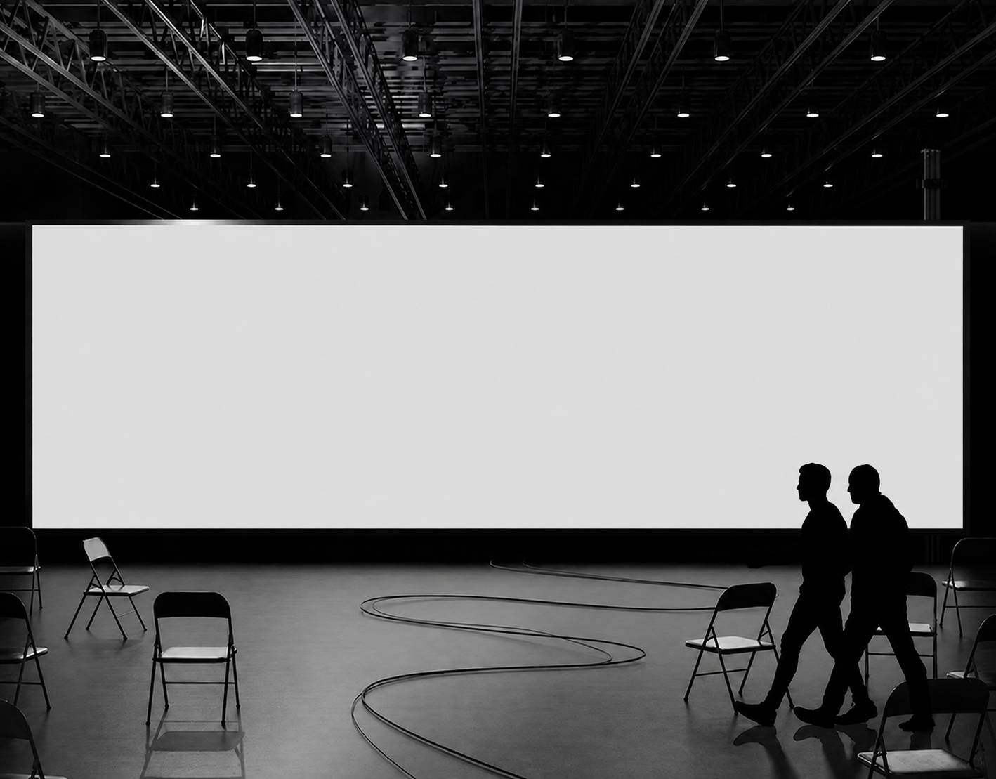 01 / Neutral photographic plate
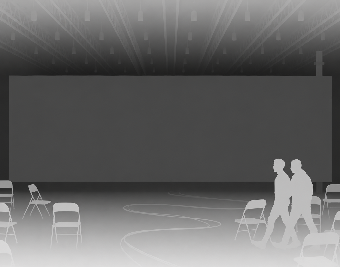 02 / Approximate depth
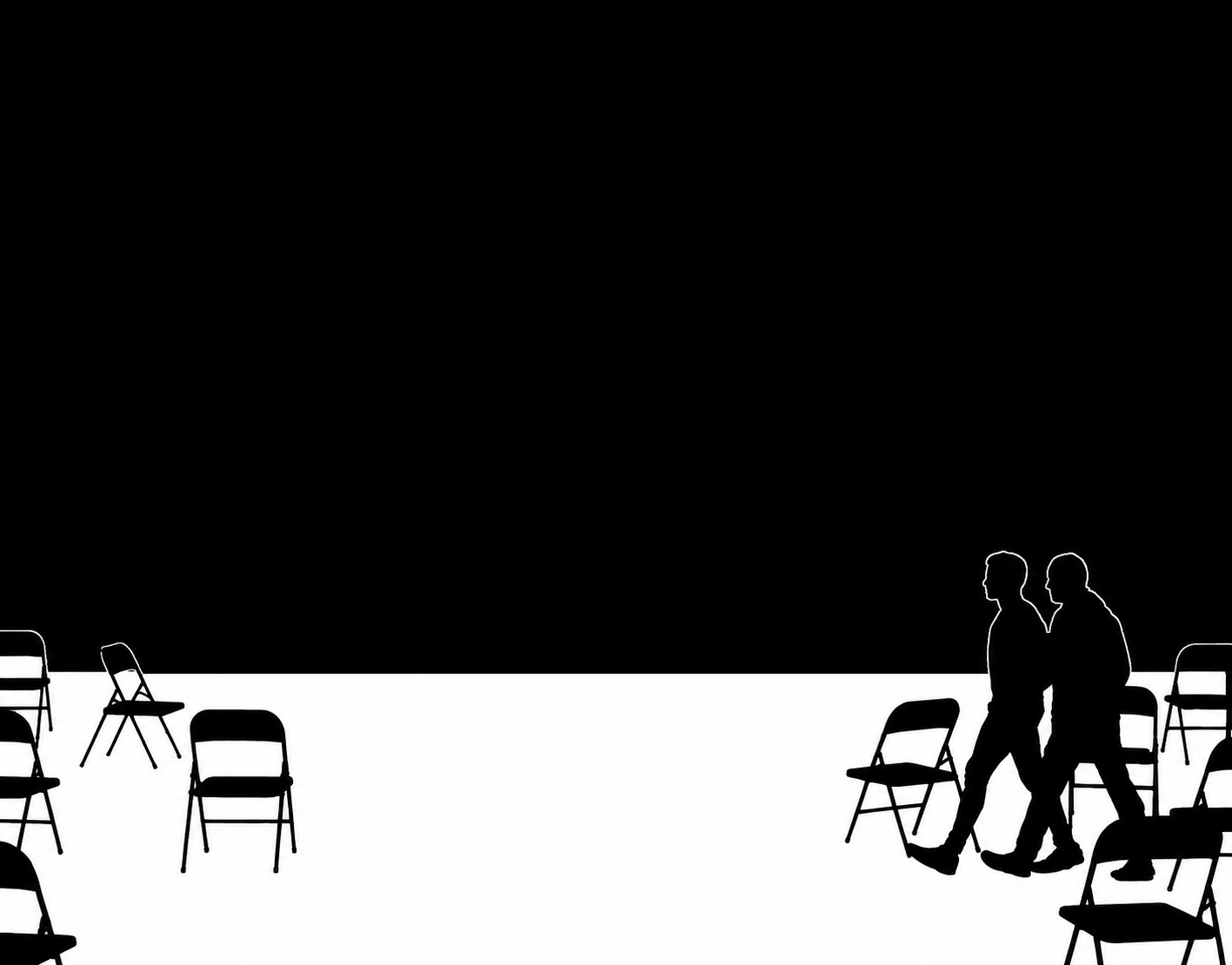 03 / Floor mask before correction
Rendering editable layouts as textures
Astra built the editable layouts with HTML and CSS, then used html-to-image to rasterise them into canvases. Three.js receives those canvases as textures.
The DOM produces the image; it isn’t a live web page running inside a reflection. Shaders scroll or blend the captured artwork, or combine it with procedural animation. When the design changes, the layout is captured again.
The shared React state holds the headline and uploaded image. Switching scenes passes that content to another renderer; changing the headline triggers a new capture. This lets the article expose the same working controls as the original experiment.
Mapping the artwork onto each surface
For flat screens, Astra calibrated the photographed corners and mapped rectangular artwork into that quadrilateral. Angled displays use perspective correction. The reflection room also uses floor, wall, and ceiling planes to calculate where reflected content should appear.
The newspaper required more work because the sheet curves and folds across its centre. Astra implemented two connected curved surface patches sharing the fold, then refined the paper boundary so the hands remained in front. The printed layout stays attached to the sheet while a selected region of its content animates.
When I pointed out that the paper looked too clean, Astra generated a paper-stock texture containing fibres, pores, and uneven density. It used that texture to vary shading, sheen, and ink coverage. Sampling it in the paper’s coordinates keeps the texture stationary while the app content changes.
Implementing reflections and light spill
An early reflection shader sampled displaced copies of the artwork to soften it. High-contrast stripes made the individual samples visible as repeated edges. I asked for a smoother floor response.
Astra changed the reflection to sample filtered textures using mipmaps: progressively smaller, averaged versions of the artwork. Selecting a coarser level merges fine lettering and stripes into a broad reflection without the same repeated-edge artefact.
A later version showed a straight vertical seam on the left of the hall. Astra traced it to automatic texture derivatives changing abruptly at clamped sampling coordinates. Explicit mip levels removed that discontinuity in the blur.
Reflection and light spill also need different treatment. A reflection retains recognisable structure; spill is a broader colour wash. In the exhibition hall they have separate controls. A calibrated floor-plane calculation locates the reflection, while a more heavily filtered sample provides the broad illumination.
Correcting the depth maps and masks
The generated depth map recognised the floor, chairs, and people, but shifted some boundaries and exaggerated thin cables. Using it to cut around foreground objects produced halos and damaged openings between chair frames.
At my suggestion, Astra generated a dedicated floor mask. Its boundary was still displaced, so the renderer needed an alignment offset and refinement against the photograph’s contrast. In the revised hall, depth influences reflection softness, while the floor mask determines where the effect can appear.
The distinction mattered around chair legs and the gaps between them. A depth map can look convincing at thumbnail size while placing those edges incorrectly. We reviewed the composite at the problem areas and corrected the mask against the actual photograph.
Making the lighting follow the design
The escalator scene gave us another way to handle coloured light. Its reference already had yellow illumination along the rails and across the floor. Astra isolated that colour in the shader and replaced it with the artwork’s accent, retaining much of the original metal detail and shading. We added a colour picker directly over the scene and a slow spectrum cycle, so trying another colour didn’t require opening the full controls.
After that, I asked Astra to invent a scene. Codex image generation produced an empty transit concourse with a blank display, metal columns and a reflective stone floor. The prompt specified one saturated lighting colour, which made it easier to isolate later. Astra put live artwork onto the display and connected its edge lights and floor response to the same accent. We later adapted the rising fire effect from our rave experiment for that screen.
Reconstructing the curved wall
The curved display was harder. Astra first traced its top and bottom edges and used a two-dimensional warp to place text between them. The outline followed the photograph, but the lettering still looked pasted on. I asked for something closer to a decal attached to a three-dimensional surface.
Astra replaced that mapping with a perspective camera and a curved mesh. Using an assumed level floor and camera height, it reconstructed points along the wall from the photographed edges. Texture coordinates follow distance along that surface, so spacing is determined by the reconstructed geometry rather than an arbitrary horizontal stretch. The floor reflection comes from mirroring the same mesh across the floor plane and rendering it with the matched camera.
This remains a reconstruction from one generated photograph. The camera and dimensions are inferred, and the image does not describe perfectly consistent architecture. Small height adjustments keep the mesh aligned with its edges. It is useful for this fixed view; it is not a measured model of a real venue.
We added mesh and UV-grid views to inspect the mapping. Checks cover the camera alignment at the endpoints, spacing along the surface, mesh continuity and the reflected geometry. Those checks can establish that the mapping behaves as intended. They cannot establish that the result looks convincing.
When correct mapping still looks wrong
I still wasn’t happy with the text. Large, clean lettering makes changes in scale, compression and surface brightness particularly obvious. Astra corrected the artwork’s proportions and added viewing-angle falloff and texture sampled from the photographic display, but the visual result remained something to judge rather than declare solved.
We then tried Pexels liquid footage across the curved wall, replacing the repeated headings, and settled on a green liquid clip. Three.js uses the video as a live texture on the mesh. The LED treatment stays on the surface, and the reflected mesh uses the same video frames. Broad colour sampled from the rendered wall supplies the surrounding light.
Video gives us a different way to assess the scene: flowing forms cross the bend continuously, without repeated words dominating the composition. It does not prove that the reconstruction is exact, or repair an incorrect camera. It lets us compare another kind of content while keeping the mapping visible in the inspection controls.
Try video on the curved wall ↗ · Green liquid footage / Pexels ↗
Making the displays feel like LEDs
Once the content was moving, the screens still looked too clean. Astra added a dot-matrix shader in the display’s own texture coordinates. It divides the image into small diode cells, with a subtle colour variation and darker gaps between them. On the curved wall, those cells follow the mesh, so they compress with the surface as it turns away from the camera.
The first version took too much brightness and clarity out of the artwork. Adding a convincing screen texture had made the displays look worse. We reduced the dark gaps, softened the colour separation and backed off the snapping of the image to individual cells. The shader also fades the pattern when the cells become smaller than the rendered pixels, reducing interference patterns in the narrow accordion cards.
Brightness and bloom needed their own adjustment. Astra added filtered highlights around bright content and a narrow bleed at the screen edge, while keeping the photographed room sharp. The floor receives a broader response through its separate reflection and spill controls. These are tuned shader effects; they suggest an illuminated display without calculating the light output of a real LED installation.
Changing the video’s colour live
The green liquid looked good on the curved wall, but I wanted to change its colour without finding another video. Astra added a shader that converts each sampled colour into hue, saturation and brightness, rotates the hue towards the chosen accent, and converts it back. That retains the moving detail and differences between colours in the footage. Saturation and brightness also respond to the chosen colour, so picking a dark accent still darkens the result.
We brought that treatment to the exhibition hall’s video too. A small colour control over the scene lets you choose an accent, and the adjacent button runs a slow spectrum cycle. You can switch recolouring off to compare the original footage. The cycle updates the shader directly, without capturing the HTML layout again on every frame.
The order matters: recolouring happens before the artwork is rendered into the textures used for reflections and broad light. A pink screen therefore supplies pink reflected light from the same moving footage. Applying a colour filter only to the finished display would leave the floor behind.
Looking at the separate layers
We added a labelled layer button to the shared toolbar at the top right of each accordion scene. Its fixed width keeps the controls still as the label changes. It cycles through the finished composite, the base photograph, the isolated screen and an added-light view. This makes it easier to see which detail belongs to the photograph and which part changes with the artwork.
The added-light view shows positive colour differences between the composite and the base image outside the screen. It is a diagnostic view, not a separate physical lighting pass: it does not show darkening or reconstruct every original light source. The curved wall also retains its mesh and UV-grid controls, while the exhibition hall has views for its approximate depth and floor mask.
Editing inside the scene
I wanted to click the displayed text itself, rather than work through a form below the mockup. Astra positioned editable HTML text over the mapped artwork, using the same font and layout. During editing, the captured copy of that text is hidden so it does not appear twice; finishing the edit updates the texture again. For the curved wall, the editor positions use the same camera projection as the mesh.
We also kept the accordion scenes mounted and clipped them to their cards. Early performance changes made the unselected scenes animate noticeably more slowly, so we adjusted the scheduling to keep visible cards moving at the same target rate. Offscreen scenes and hidden tabs can sleep. Video playback follows visibility too, avoiding playback work when its scene is out of view.
Where else we could use this
The same approach could support app demos and portfolios. A product team could put a captured interface into a photographed device, show a scrolling sequence, and let a reviewer compare versions. A designer could present several pieces of work inside a consistent set of scenes.
For exhibitions or events, we could use photographs of a proposed venue to explore screen content and its approximate lighting effect. That would be useful for discussing the visual direction, although this renderer wouldn’t tell us the real brightness or lighting requirements of an installation.
The paper treatment could also be adapted to posters, book covers, or packaging previews. Each new surface would need its own mapping and material treatment, but the editable layout and texture pipeline could be reused.
These are possible extensions of the experiment. So far, the collection includes the original photographic references, a generated concourse, and a curved LED wall, with shared content controls and image exports.
What the implementation supports
These scenes are photographic composites with calibrated shader effects. They are not fully reconstructed rooms, and the lighting is not a complete physical simulation. Moving the camera would expose information the photograph doesn’t contain.
Large exports render the artwork at high resolution, but don’t create photographic detail beyond the source asset. The masks and depth maps remain approximations.
The embedded examples expose the result directly: editable artwork, scene-specific material controls, animated content, and PNG exports. They also make the remaining limitations visible, particularly at foreground boundaries and where the original photograph contains lighting that cannot be fully separated from its surfaces.
Back to the working mockups ↑